
Clarity in Marketing: The Cracker Barrel Billboard That Accidentally Proved the Point
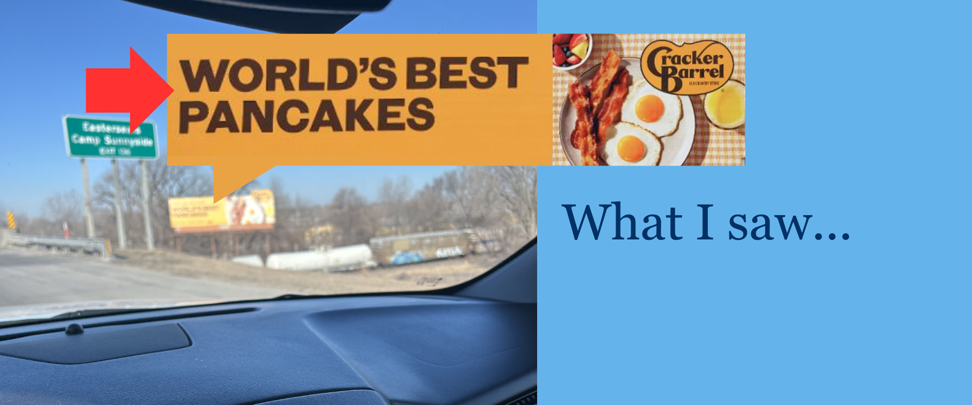
I drive past this Cracker Barrel billboard regularly.
Big words. Big food photo. Simple promise: WORLD’S BEST PANCAKES
But the picture shows…
A plate of eggs and bacon.
Only later, when I Googled the “Cracker Barrel Pancake Billboard,” did I notice the tiny words tucked above it: “Not pictured.”
In the split second I have to see the sign, my eyes go directly to the BIG BOLD WORDS.
That’s the whole problem, not only with Cracker Barrel, but with marketing in general.
In real life, your audience takes one fast glance, forms a conclusion, and moves on.
And if the “main thing” isn’t instantly clear, your message becomes a guessing game.
(PSA: Rarely is your customer going to give you a second chance and Google the answer.)
What is clarity in marketing?
Clarity in marketing means a buyer can understand what you do, who it’s for, and what to do next in about three seconds.
If they can’t repeat it back to you after a quick glance, your messaging isn’t clear—this is the basic case for why clarity matters in marketing copy.
That’s it. That’s the standard.
Not “Did we sound clever?”
Not “Did we use the right brand voice?”
Not “Did we impress other marketers?”
Just: Did the customer get it?
The billboard problem
Let’s be honest: the billboard is doing what most businesses do.
It’s making a bold claim… and then making you work to reconcile the details.
Headline says pancakes
Image shows eggs and bacon
Fine print says don’t worry about it
That’s a design issue that creates a clarity problem.
And clarity problems are sneaky because the creator knows what they meant, but the customer doesn’t.
Your customer only has what you showed them.
And your brain (and theirs) will always trust the biggest, clearest signal first—this is exactly why first-impression and visual-design testing is such a brutal truth serum.
Clarity beats cleverness
I hate to pick on Cracker Barrel after all they’ve been through recently.
So, this isn’t a jab, it’s a clear example of unclear messaging.
When a brand is in “refresh mode,” the bar for clarity gets higher, not lower. People are already watching. They’re already suspicious. They’re already asking, “Is this still for me?”
That’s why mixed signals hurt more during a rebrand.
Most marketing teams overvalue cleverness because cleverness is fun.
Clarity is boring… until you see your numbers.
Here’s the truth: If your marketing makes people think, it makes them leave.
When something is easy to process, it feels more trustworthy. When it’s hard to process, we hesitate. And the research on processing fluency and judgment backs this up.
Clarity is a conversion tool, not a writing preference. And if you’re looking at site engagement like:
short time on page
high bounce
high exit
…clarity is one of the first suspects.
It’s not a matter of “bad” content necessarily. It’s because people overlook content that makes them work too hard to find the point.
Most “ad problems” are actually clarity problems. And that’s why you must ruthlessly eliminate any confusion within your advertising and marketing.
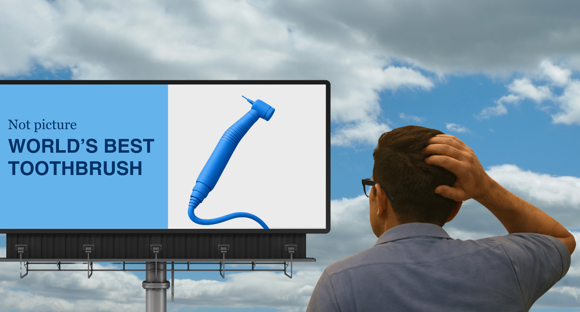
The “Not Pictured” Principle
Here’s the simplest way I know to diagnose unclear messaging:
If the core promise isn’t instantly visible, your audience will fill in the blanks.
And they’ll usually fill them in wrong.
That’s the Not Pictured Principle.
It shows up everywhere:
1) The homepage that hides what you do
For example, you land on a site and see: “We help brands unlock growth through innovative solutions.”
Cool. What do you do? Years ago I worked with a small company that would not stray from their company tagline: “People who work. People who care.”
It sounded nice. But it was unclear.
You might guess they were an HR software company or an employment agency (the common answer we got during research).
They were a transportation manufacturing company.
2) The offer that’s buried under adjectives
“Premium, bespoke, next-gen support.” Support for what?
Again, prioritize simplicity or complexity.
3) The CTA that asks for commitment before clarity
“Book a call.”
About what? Why? For who?
Your CTA needs to be clear and relevant to the content it’s associated with.
4) The visuals that contradict the words
Like… pancakes next to bacon.
When visuals and copy disagree, the buyer doesn’t “blend them.” They get confused. It’s a classic example of mixed-signals brand messaging.
The 5 biggest clarity killers (and the fix for each)
Most “bad marketing” is just unclear marketing wearing a nice outfit.
Let’s fix the usual offenders.
1) You lead with your company… not the customer
Unclear: “We’re a full-service agency.”
Clear: “We help local service businesses get more booked calls.”
Your customer is asking: Is this for me? Answer that first.
This is why customer avatars matter. When you know who you’re talking to, clarity gets easier. If you want the practical version, use your own guide on how to create a customer avatar step-by-step.
2) You sell features instead of outcomes
Features are what you built. Outcomes are what they want.
Unclear: “AI-powered dashboard with customizable workflows.”
Clear: “See what’s working in one place, so you stop wasting spend.”
Concrete language makes people feel like you’re actually listening—and that affects trust and purchase intent. (There’s strong evidence for this in consumer research like Schwarz’s work on processing fluency.)
3) You use insider language
If your customer needs a decoder ring, you lost.
Unclear: “We optimize omnichannel attribution.”
Clear: “We show you which channels are driving revenue.”
This one is brutal because it often comes from good intentions (“we want to sound legit”). But clarity is what earns trust, not jargon—again, see the way mixed signals confuse your audience.
4) You try to say everything at once
When you try to be for everyone, you become clear to no one.
Instead, focus on: One offer. One audience. One job.
One reason messaging gets messy is because there’s no shared internal structure. That’s why a brand messaging framework helps: it forces you to define the message before you decorate it.
5) Your “main thing” isn’t the main thing
This is the billboard lesson.
If the headline says pancakes, show pancakes.
If the headline says “booked calls,” show the result (calendar filled, leads, proof), not a moody abstract photo.
Because people don’t read details in five seconds. They notice the dominant signal and decide if they’re in the right place—which is why visual design testing is so revealing.
A 15-minute clarity checklist (use it on your homepage, ads, and landing pages)
If you want clear messaging, stop “editing words” and start answering questions.
Here’s the checklist.
15-Minute Clarity Checklist
Use this on your homepage, ads, and landing pages. Stop “editing words” and start answering questions.
1) Who is this for?
Be specific. Not “business owners.” Not “brands.”
2) What do you help them do?
Use a verb. Make it repeatable.
3) What’s the payoff?
What’s different after they buy?
4) Why should they believe you?
Proof: numbers, logos, short case result, strong claim + evidence.
5) What should they do next?
One clear CTA. Not five competing buttons.
Tip: Run the 5-second test. Show the page/asset for 5 seconds and ask someone to repeat it back.
If you’ve never forced yourself into a single message, you’ll like this: ForEntrepreneurs’ breakdown of clarity of message (it’s simple, and it’s annoying in the best way).
And if you want a quick “messaging map” to build from, here’s a clean outline: five steps to a messaging framework.
How to test clarity fast (before you spend money)
Clarity isn’t a personality trait. It’s testable.
The 5-second test
Show someone your homepage (or ad) for five seconds.
Then ask:
What do you think this company does?
Who is it for?
What would you do next?
This is a known usability technique—and here’s the clearest explainer on it: the 5-second usability test.
The repeat-back test
Ask a friend (not in your industry) to describe your offer in one sentence.
If they can’t, don’t “explain it better.” Fix the message.
The scroll test
If your offer is below the fold, that’s not “premium design.”
That’s “Not pictured.”
Clarity is also your best SEO and GEO move
Clear messaging doesn’t just convert humans.
It also helps machines.
AI tools pull from content they can:
understand quickly
summarize confidently
quote cleanly
That’s why GEO (Generative Engine Optimization) works so well when your definitions are tight and your structure is clean. If you want the full playbook, link this to The Complete Guide to GEO.
A simple rule:
If a sentence can’t be quoted as an answer, it probably won’t get cited as an answer.
This is also why “story” works when it’s done right. Story provides a clean mental model instead of a pile of claims.
FAQ: Clarity in marketing
What is clarity in marketing?
Clarity in marketing is when a customer can quickly understand what you offer, who it’s for, and what to do next—without needing extra context. See the practical case for clarity in marketing copy.
Why is clear messaging important?
Clear messaging reduces confusion and makes it easier for people to trust you and take action. When your message is easy to process, it tends to feel more credible, this is supported by research on processing fluency.
How do I know if my marketing is confusing?
If you’re attracting the wrong leads, getting “So… what do you do?” questions, or seeing high bounce and short time-on-page, your messaging is likely sending mixed signals. Here’s a helpful breakdown of how to tell if messaging is clear or confusing.
What’s the fastest way to improve clarity on my website?
Use a simple checklist: who it’s for, what you help them do, the payoff, proof, and one clear CTA. Then run a 5-second test to see what people actually remember.
How does clarity help SEO and GEO?
Clear, structured content is easier for Google to understand and easier for AI tools to summarize and cite. That’s the spine of Generative Engine Optimization.
The billboard takeaway
That Cracker Barrel billboard does what unclear marketing always does: It makes the audience guess.
And guessing is expensive.
Because confusion doesn’t create curiosity. It creates friction.
And friction doesn’t create buyers. It creates exits.
So here’s your move this week:
Pick one page (homepage, services page, landing page).
Run the 15-minute clarity checklist.
Then run the 5-second test.
If the “pancakes” aren’t pictured, fix that first.
Want help? Start by reading what to fix first when marketing isn’t working.

Author: Noah Swanson
Noah Swanson is the founder and Chief Content Officer of Type and Tale.